
Business Analyst & UX Designer
I led the research behind a centralized IT support platform for students, faculty, and staff, then designed and built its navigation, service experience, and front-end interface.
The Service Desk is a centralized IT support platform developed for Emily Carr University. My goal was to improve how students, faculty, and staff find information, request support, and navigate IT services through a more connected and user-centred experience.
I led the research, including a journey-mapping workshop with students and one-on-one usability testing with faculty and staff. These findings shaped the information architecture, navigation, service catalogue, Knowledge Base, homepage, and overall support flow.
I designed and built the experience within TeamDynamix, including custom HTML and CSS modules, visual styling, service integrations, automated ticket-email templates, and supporting videos. After launch, I continued reviewing analytics and user feedback to improve the platform over time.
- Role
- Business Analyst & UX Designer
- Tools
- Figma · HTML/CSS · TeamDynamix
- Scope
- Research · Service Design · Front-End
- Status
- Launched · 2024
User Research
Before designing anything, I mapped the actual experience on campus, with the people living it.
Mapping the full student experience
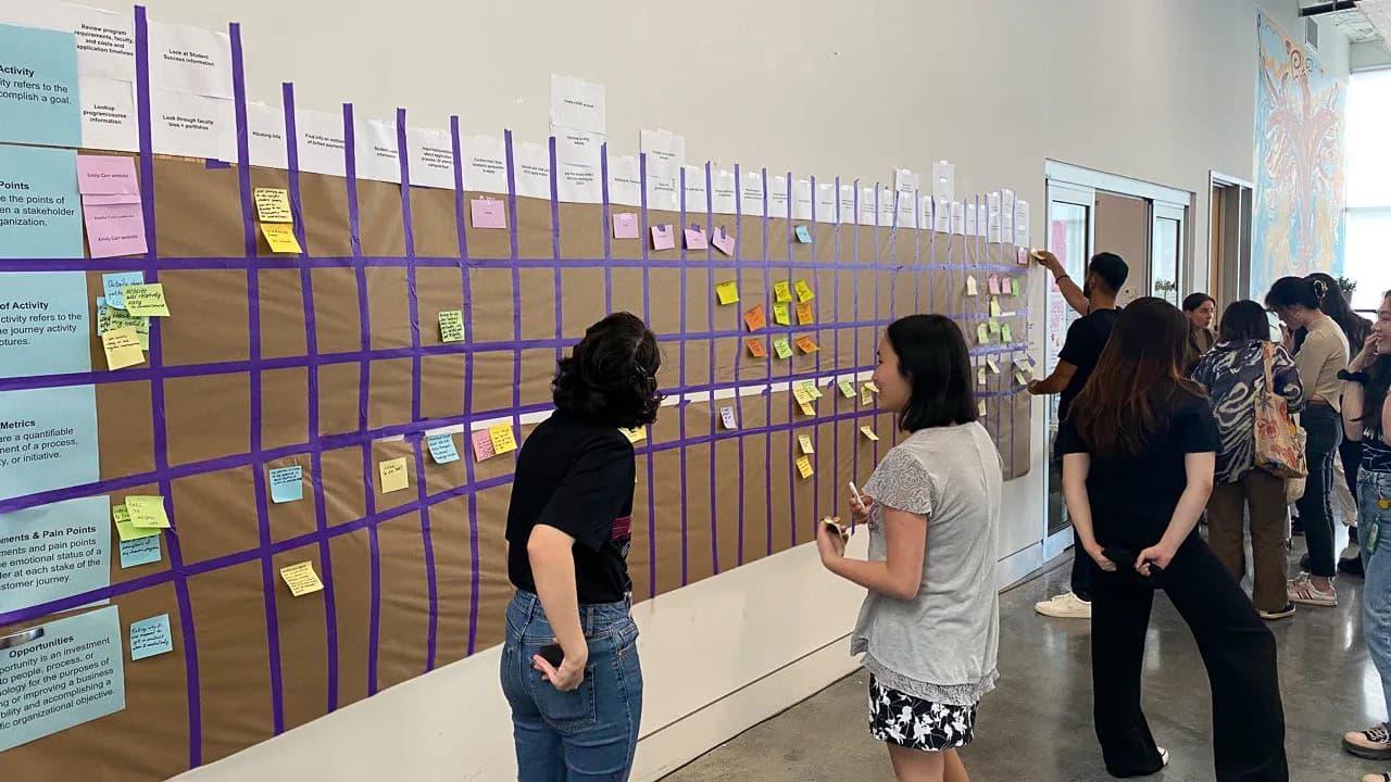
I led a journey-mapping workshop with students to understand how they interacted with IT services across their university experience. Participants documented key moments, pain points, and opportunities at each stage, which helped identify where information, support, and communication were breaking down.
Running the workshop on campus
The map was laid out in rows for touchpoints, key moments, pain points, and opportunities. Participants used sticky notes to add their own experiences at each step, which made the research a live, collaborative activity rather than a private analysis.
Research Findings
Three problems surfaced again and again.
Support was spread across disconnected systems
Students, faculty, and staff had to move between multiple websites, tools, and communication channels to find IT support. This created information overload and made it difficult to know where to begin or which source to trust.
Users relied heavily on direct support
Many users contacted the IT team for issues they could potentially resolve themselves because clear self-service guidance was difficult to find. The research highlighted the need for an accessible Knowledge Base and a more flexible way to submit and track requests.
Inconsistent information reduced confidence
Information was sometimes duplicated, inconsistent, or difficult to maintain across the different locations that held it. This affected users’ confidence in the guidance they found and created additional barriers when they were completing tasks or adopting unfamiliar tools.
Connected Support System
The fix started with architecture, not screens.
Connecting Service Desk with existing IT pages
I reviewed the information architecture of ECU’s existing IT pages to understand how the new Service Desk should connect with the broader university website. This revealed opportunities to reduce duplication, clarify entry points, and guide users between information, self-service resources, and direct support.
One clear entry point for IT support
The “Need ITS Help?” page became a clear bridge between the main IT Services website and the Service Desk. It helps users decide whether to browse information, search the Knowledge Base, explore services, or submit a support request.
Design System
ECU’s identity, rendered through a platform I did not control.
Extending ECU’s identity into a new platform
I adapted ECU’s identity to the constraints of TeamDynamix, so the Service Desk reads as part of the university while staying recognisable on its own.
One hue, three weights
A solid teal for anything clickable, a light tint for rules, and a near white for panels holding someone else’s words — the same three weights that carry into the ticket email.
- Action#0CA0A0Buttons, links, outlines, email CTA
- Light blue#C0ECF0Section rules and highlights
- Tint#EEFAFAPanels holding someone else’s words
Neutrals
- Charcoal#262A31Site nav bar and email header
- Heading#444444Headings and primary labels
- Body#777777Supporting text and values
One module, two tiers
The homepage entry points are one 240 × 44 button used twice. Research had shown people did not know where to begin, so hierarchy is carried by fill weight alone.
Three filled, two outlined — the homepage uses one module twice.
- Button 240 × 44
- Gutter 8
- Row 736 = 3 × 240 + 2 × 8
- Nav 34 · rule 4
Designing within a platform’s limits
TeamDynamix owns the search, sign-in, ticket forms and page skeleton, so I treated its defaults as a constraint to design around rather than a surface to override.
Designed
Homepage modules · entry hierarchy · catalogue structure · Knowledge Base organisation · colour · email template
Fixed by TeamDynamix
Search control · sign-in · ticket forms · table markup · breadcrumbs · page skeleton
The Web Platform
Then the screens themselves — a gateway to every IT resource.
A central gateway to IT support
I designed and developed custom HTML and CSS modules for the Service Desk homepage, creating clear entry points to the Service Catalog, Knowledge Base, active technology issues, and ticketing tools. The layout prioritizes common needs without exposing the platform’s complexity.
Clear service requests from start to finish
The Service Catalog organizes support options into clear categories for students, faculty, and staff. Each service explains what is available, what information is required to start it, and what users can expect to happen after they submit a request.
Resolving common issues independently
The Knowledge Base gives users access to practical guidance on accounts, software, devices, and campus technology. Articles are organized to support quick troubleshooting while still providing a clear path to submit a ticket when self-service is not enough.
Ticket Communications
Clear updates throughout the support process
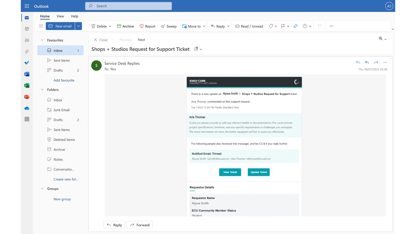
I designed and developed a reusable email template for ticket creation, updates, comments, and resolution. The template presents changing ticket information within a consistent hierarchy, helping users understand what happened, what requires attention, and how to return to their request.
What I learned
Research should define the solution
The project reinforced that a new platform is only useful when it responds to clearly understood problems. Journey mapping and usability testing helped us prioritize changes based on real user needs rather than assumptions about what the organization should build.
Working within a platform’s constraints
TeamDynamix provided the underlying service-management functionality but also imposed visual and technical limits. I learned how to work within those constraints while extending ECU’s identity and improving the experience through custom HTML, CSS, content structure, and interaction design.
Improvement continues after launch
Launching the Service Desk was not the end of the design process. Reviewing analytics, gathering user feedback, and refining the platform over time showed me how service design continues through ongoing maintenance, content updates, and incremental improvements.
We Care