UI/UX Designer & Unreal Developer
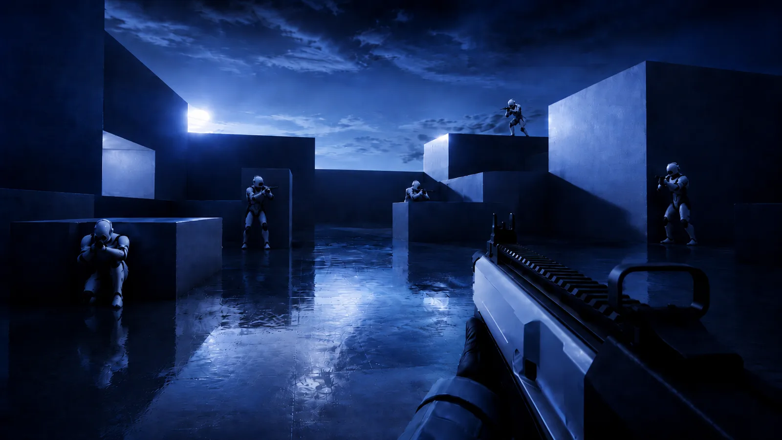
Holdout is a survival-wave FPS built to demonstrate a complete game interface system in Unreal Engine 5. I designed, animated, and implemented the HUD, menus, and supporting gameplay systems.
Holdout is a wave-survival first-person shooter I developed as an independent technical UI project. Its central focus is a complete HUD and menu system designed around a restrained night-operations visual language, reusable interface rules, motion, and a push-based connection between gameplay and UI.
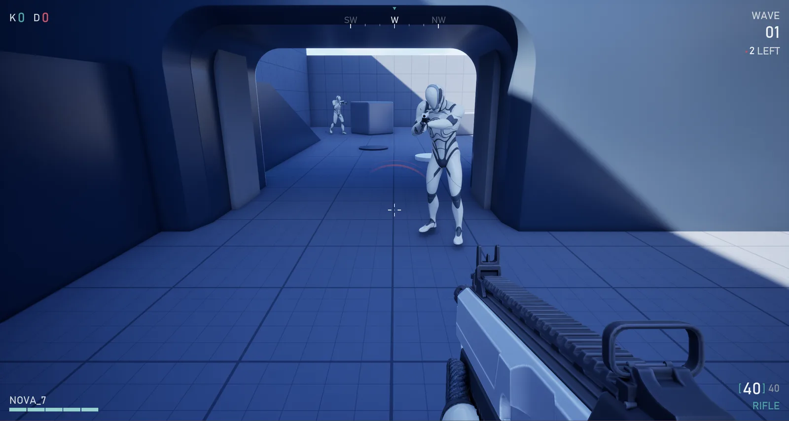
I extended the gameplay with weapon swapping and a wave system so the interface could be implemented and tested against real state changes. Wave progress, enemies remaining, kills, health, ammunition, damage direction, countdowns, and fail-state statistics all update from their corresponding gameplay sources.
Alongside the UI, I adjusted the environment’s lighting and colour treatment to strengthen the mood and create a more cohesive visual experience. The project is still in development and brings together UX, visual design, motion, implementation, and interface engineering.
- Role
- UI/UX Designer & Unreal Developer
- Tools
- Unreal Engine 5 · Blueprint
- Scope
- HUD · Menus · Motion · Gameplay
- Status
- In Development · 2026–Present
Design System
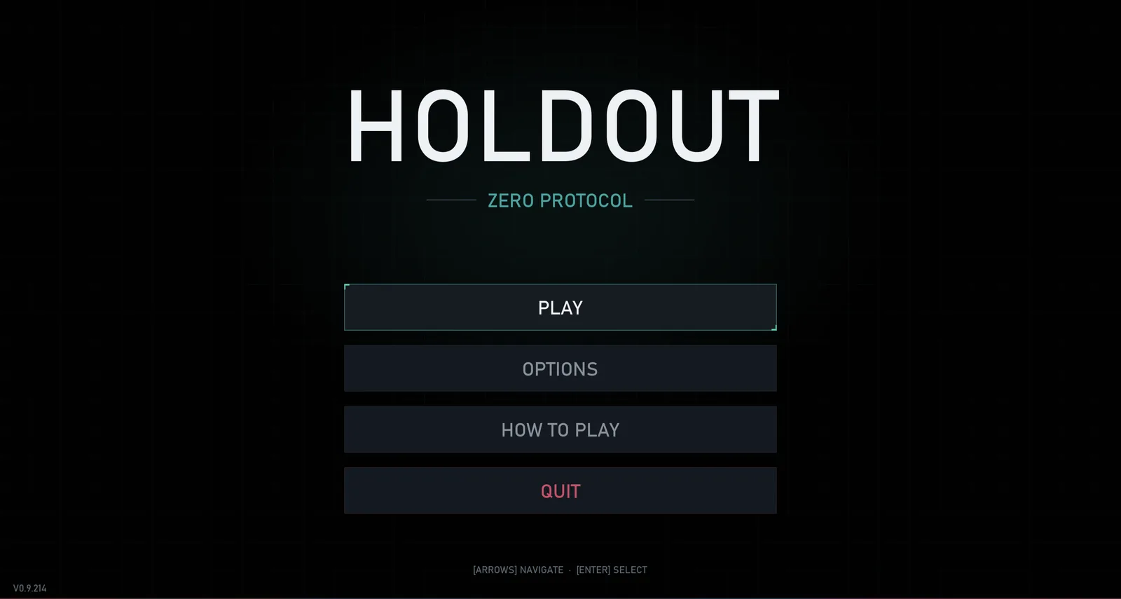
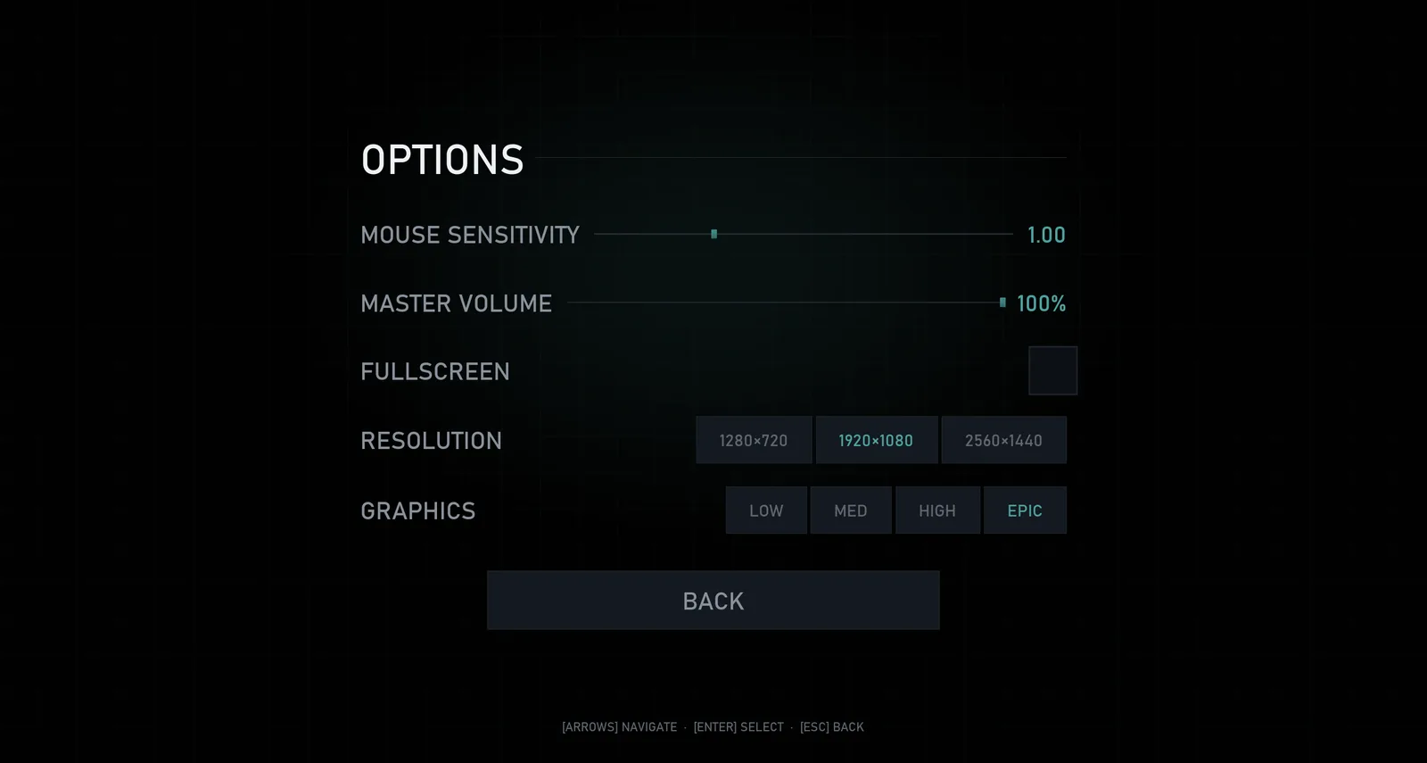
I created a compact token system to keep the HUD and eight menu screens visually consistent. Colour, typography, spacing, layout, components, and motion follow shared rules, with documented adjustments where text appears directly over gameplay.
Assigning one purpose to each colour
Teal identifies interactive, active, and positive states, while red communicates danger, damage, and failure. A neutral greyscale hierarchy separates primary values, labels, secondary information, panels, and backgrounds. Applying these meanings consistently helps players interpret the interface without relying on additional explanation.
Using one shared type system
Bahnschrift, uppercase styling, letter spacing, and a shared type scale create continuity from the title treatment to small HUD labels. I used the same colour-token values across the interface, then increased the brightness of teal and selected HUD labels where gameplay backgrounds required stronger contrast.
HUD Architecture
I built the HUD around a push-based data flow rather than checking gameplay values every frame. Gameplay systems send updates only when a relevant state changes, allowing the interface to remain separate from the underlying mechanics without adding HUD Tick logic.
Updating UI only when state changes
The character, game mode, and projectile systems send state through a Blueprint interface on the player controller. The controller routes each update to corresponding Receive functions in the HUD widget, so values change in response to events rather than continuous polling.
Connecting each element to gameplay
Health updates through a Receive Health call, ammunition through Receive Bullets, and wave information through the game mode. Enemy deaths update the hostile counter and score, the damage arc rotates toward the attacker and fades over 1.2s, and the compass reads the controller’s current yaw.
Wave System
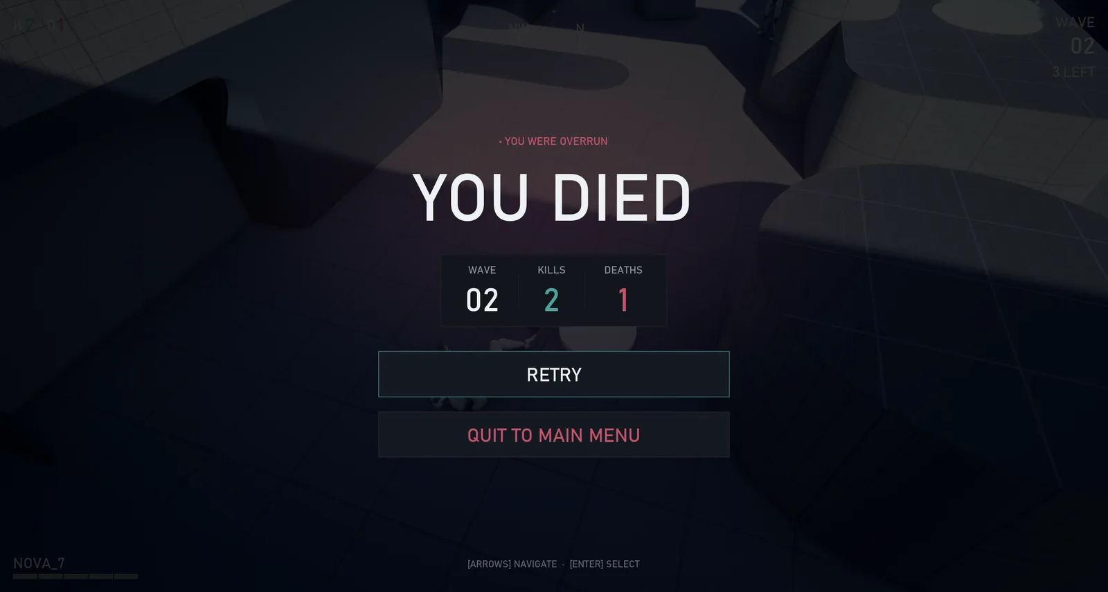
I created a state machine in the game mode to manage wave progression, enemy counts, escalation, and time between rounds. The same system also controls the interface states associated with starting, completing, and failing a wave.
Managing progression from one system
The wave manager tracks the current wave and number of enemies remaining, spawns increasingly difficult rounds, and controls the interval between them. I connected enemy deaths to the existing scoring event so one signal updates both the score and hostile counter.
Driving multiple interface states
The state machine controls the HUD wave counter, incoming-wave banner, between-wave countdown, and final wave statistic on the death screen. Because each interface state receives information from the same system, wave values remain consistent across gameplay and menus.
Motion Design
I developed a restrained motion language using short mechanical movements, firm stops, and no bounce or overshoot. A shared mathematical ease-out curve implemented in Blueprint gives banners, HUD feedback, menus, and transitions a consistent sense of timing.
Building motion through timed stages
The incoming-wave banner assembles through a sequence lasting approximately 0.4s. The background plate appears first, followed by the teal rules, the “INCOMING” label, and the wave number. Separating the motion into timed stages gives the announcement clearer hierarchy than a single fade.
Applying one timing system throughout
The same fast ease-out controls the HUD boot-up sequence, the hitmarker, the countdown emphasis, per-kill feedback, and menu transitions. Reusing the timing curve gives separate interface events a consistent visual rhythm while allowing their duration and scale to vary by purpose.
Design Decisions
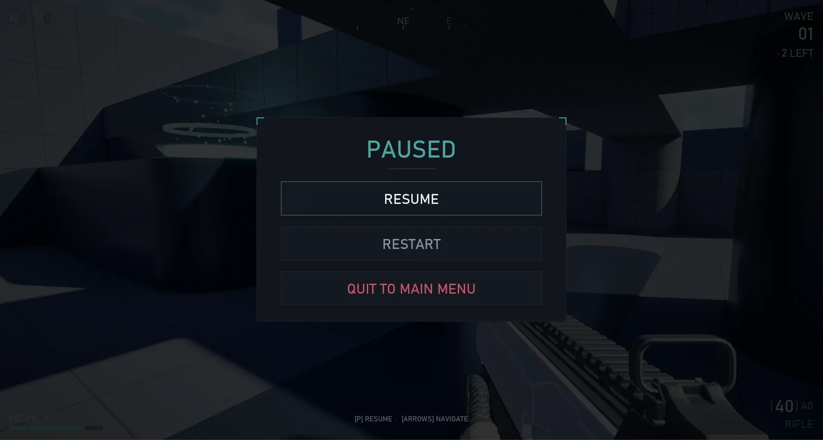
Several design decisions came from testing the interface against changing gameplay conditions. These adjustments balanced readability, visual consistency, technical constraints, and the need to preserve visibility of the game world.
Maintaining legibility over gameplay
The HUD initially lost contrast over brighter parts of the arena. I tested an edge scrim, individual text shadows, and solid backing plates, then used plates for major overlays with corner vignettes and brighter labels for persistent HUD elements. This improved readability without covering important gameplay areas.
Adapting the world to the interface
I designed the directional damage indicator as a thin segmented bracket so it matched the interface’s existing geometry. I also shifted the original arena from bright orange lighting toward a desaturated night-operations palette, improving HUD contrast and creating a more cohesive relationship between the environment and interface.
What I learned
Architecture shapes interface quality
Building the HUD around event-based updates showed me how strongly interface quality depends on architecture. Separating gameplay logic from presentation made the system easier to expand, while shared motion rules helped feedback remain purposeful rather than becoming visual decoration.
Documentation protects long-term consistency
Documenting colour, typography, layout, components, and motion made it easier to identify inconsistencies across the HUD and the eight menu screens. Recording intentional exceptions alongside the rules also prevented one-off adjustments from gradually weakening the broader visual language.
Rules sometimes require exceptions
Testing revealed situations where strict consistency reduced usability, particularly when interface elements appeared over gameplay. Brightening selected labels and adjusting the environment showed me that a design system should guide decisions while still allowing documented exceptions when context requires them.
Feral