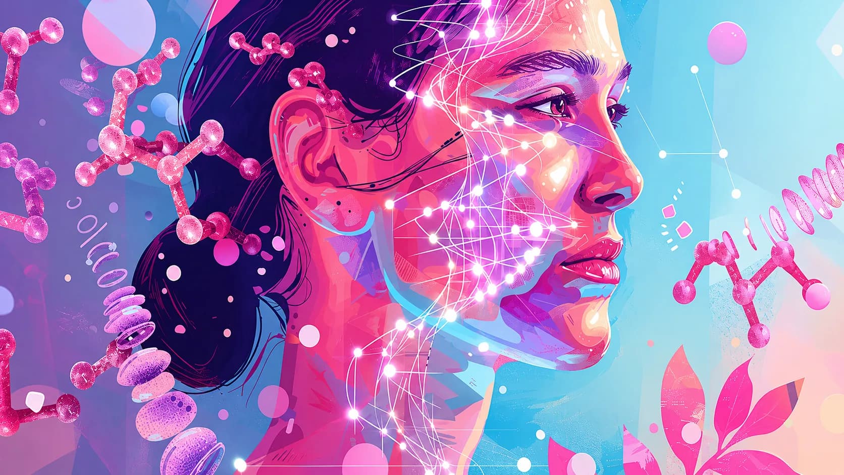
Product, UX & Visual Designer
An award-winning speculative healthcare ecosystem for clinical teams and individuals. I created its research, UX, visual identity, prototypes, and motion design.
We Care is an award-winning speculative healthcare project developed as my university graduation project. My goal was to explore how personalized health systems could support clinical teams and individuals through accessible, connected digital experiences.
I designed the complete ecosystem, including desktop software for clinical teams and a mobile app for individuals. My work covered research, UX strategy, interface design, visual identity, prototyping, user testing, motion, and 3D animation.
The project was shaped through testing with students, healthcare professionals, and general users, along with guidance from university faculty and external mentors at SFU and BC Cancer. It received the ECU Health Design Award for Service and brought the concept from research and strategy through prototyping and visual storytelling.
- Role
- Product, UX & Visual Designer
- Tools
- Figma · Adobe · Blender
- Scope
- Research · Software · Mobile · Prototype
- Status
- Completed · 2023
Problem Space
I became fascinated by how design could shape healthcare and biotech — and how rarely those fields were designed around the people using them. We Care started from three gaps.
Care built around averages, not individuals
Healthcare still leans on a generalized model that prioritizes treatment over prevention. It adapts poorly to the individual, which is exactly where genomic medicine promises the most, and where personalized insight could shape earlier and more preventive decisions.
Health insight patients cannot reach
People face real friction understanding their own health risks, let alone acting on them. Without accessible insight, informed decisions stay out of reach, and the genomic information that could guide prevention remains difficult to interpret.
Tools that slow clinical analysis
Clinicians and researchers work with complex, interconnected data and few capable, GUI-based tools for genomic study. The analysis is demanding enough without an interface that adds friction, which leaves technical pipelines as the main route through the work.
The Ecosystem
We Care answers those gaps with one connected system, grounded in the principles of P4 medicine.
One system for clinics and individuals
We Care is a speculative ecosystem that connects desktop software for clinical teams with a mobile app for individuals. Both sides work from the same genomic insight, so professional analysis and everyday health management stay part of one picture rather than separate tools.
Built on P4 medicine
The concept is grounded in the four principles of P4 medicine: Personalized, Predictive, Preventive, and Participatory. They shape how the system presents individual insight, anticipates risk, supports preventive action, and gives people an active role in their own care rather than a passive one.
 Care recipient
 Sequence sample
 Sequencing
 Genomics analysis / Drug study
 Clinic team meeting
 Personalized and participatory care plan
 Data-driven digital twin
Every stage above feeds the digital twin, and the genomics stage reads back off it.
Clinical Software
For clinical teams: a desktop platform that turns genomic pipelines into something a team can drive.
GUI tools over raw pipelines
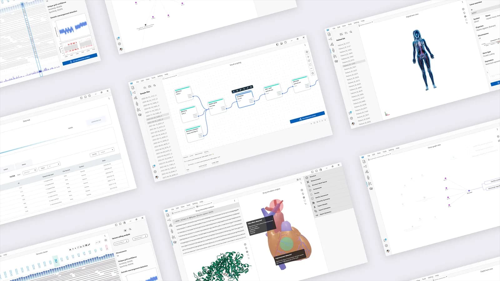
The software pairs GUI-based computational tools with genomic analysis pipelines, using data-driven digital-twin technology to turn sequence data into personalized health insight, including AI-powered drug simulations. It is presented as a design concept rather than a working medical system.
A workspace for genomic research
A calm, professional visual language and a collapsible tool sidebar hold the suite together: file explorer, visual scripting, genome viewer, predisposition, disease pathways, and drug analysis. Teams move from data to interpretable findings without switching between disconnected tools.
Testing the arrangement
Every layout carries the same elements, so the comparison is about structure alone. Both rejected arrangements fail the same way, by separating a result from the evidence it rests on.
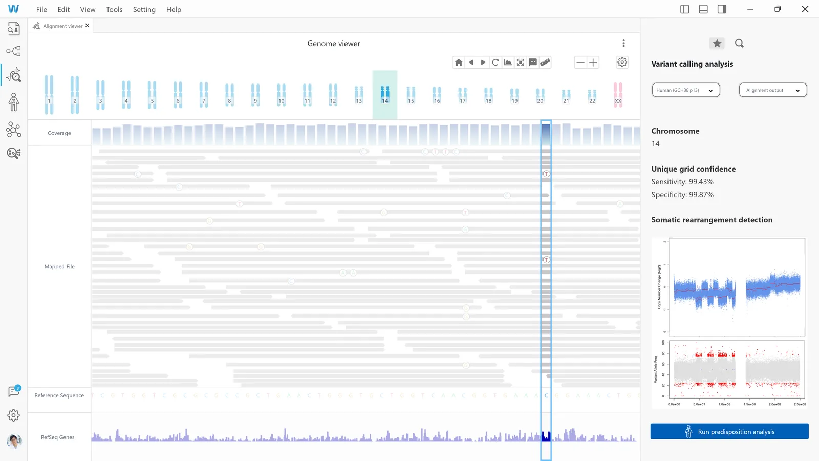
Genome viewer
The screen had to hold a tool rail, five data tracks and an interpretation panel at once.
Toolbar on top
Interpretation falls below the fold, and the run action off-screen.
Rejected direction.Analysis on a second tab
Both views get the full canvas, but never at the same time.
Rejected direction.Rail, data, panel — chosen
Three zones, one job each. The panel sits beside the evidence.
Chosen direction.Genome viewer — layout specification
- Screen
- Variant calling / alignment view
- Source
- 1600 × 900
- Units
- px
- Grid
- 8 px
Colour
- Action#2965A9Run controls and primary confirmations
- Data blue#B1D8E6Ideogram, coverage histogram, read density
- Surface#F8F8F8Tool rail, analysis panel, label column
- Canvas#EEEEEEWorkspace behind the data tracks
Mobile Experience
For the individual: a companion app that hands the same insight back to the person it belongs to.
A companion app for daily use
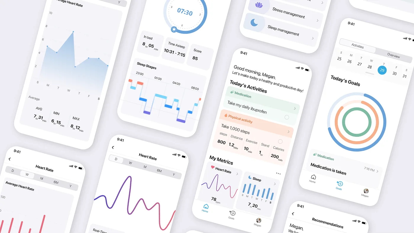
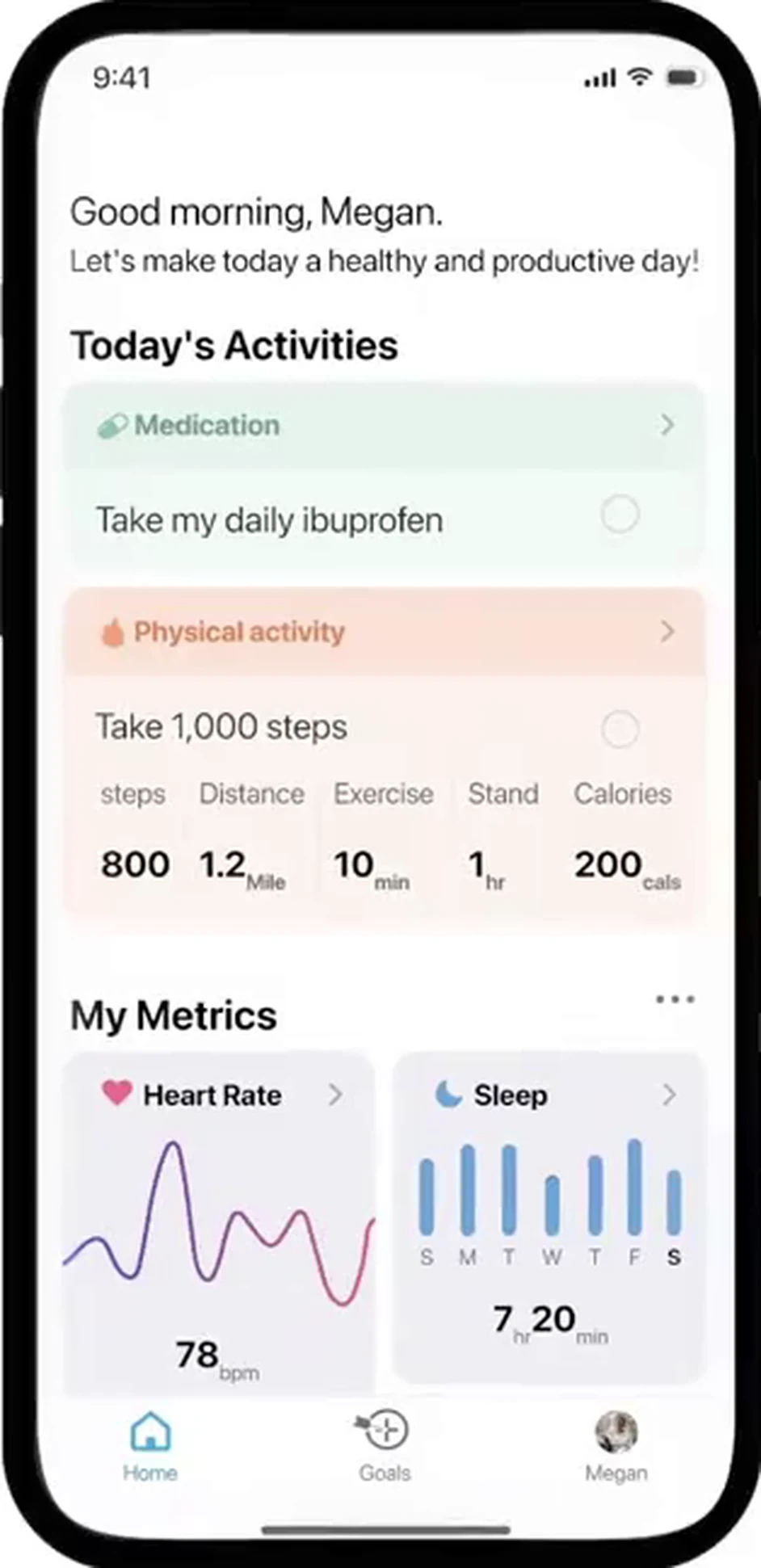
The app brings genomic insight and wearable-tech data together into personalized recommendations, goal tracking, and progress monitoring. A softer, warmer visual language separates it from the clinical software while keeping both sides recognizably part of the same system.
Metrics, goals, and controlled sharing
A home surfaces Today’s Activities, metrics, and the Education Hub; My Metrics lets people choose what they follow; Goals carry tailored reminders; and Profile decides who in a care network can see selected updates. Sharing stays a user-controlled choice.
Ordering the home screen
The same six blocks in three orders. Sequence is the whole design on a screen someone opens before breakfast.
App home
Six blocks in one column, where the order decides what the app is for.
Metrics first
Opening on data makes it a dashboard, with the day’s actions below.
Rejected direction.One undivided feed
Without grouping, a reminder and a resting heart rate look equal.
Rejected direction.Actions, then evidence — chosen
Each block answers a question raised by the one above it.
Chosen direction.App home — layout specification
- Screen
- Home / Today
- Viewport
- 393 pt
- Units
- pt
- Grid
- 8 pt
Rules
- Cards run the full content column.
- Tiles run half, two up.
- Every step is a multiple of 8.
- Category colour is never used for actions.
Colour
- Action#38B0D8Primary button, active tab, selected date
- Medication#78B8A0Chip, card tint, goal ring, timeline row
- Activity#F0A888Chip, card tint, goal ring, step gauge
- Sleep#68A0D8Tile sparkline, weekly bars, hypnogram
The action colour is the only token that changes between the two products — lighter here, darker in the software, where it has to hold against dense grey data.
The Analysis Pipeline
Six tools, but only one path through them.
Sequencing the workspace rather than listing it
The software presents six tools, but they are not alternatives — each depends on the output of the one before it. I designed the workspace as an ordered pipeline and used the sidebar for re-entry rather than navigation.
Launching the next stage from inside the current one
Rather than asking a clinician to learn the order and return to the rail between steps, each stage ends in the action that begins the next. The genome viewer’s analysis panel closes with a run control placed after the confidence figures, so the decision to continue happens where the evidence for continuing is displayed.
Giving each zone one responsibility
The genome viewer divides into three zones: a rail that holds tools, a workspace that holds data, and a panel that holds interpretation and the action that leaves the screen. Data tracks stack vertically because they share one horizontal coordinate — genomic position — so a variant aligns across coverage, reads, sequence and genes in a single vertical read.

File explorer — imports sequence files and organises the data within the software.

Visual scripting — handles the processing required to align sequence files against the reference genome.

Genome viewer — visualises the reads against the reference genome and initiates variant calling.

Predisposition analysis — applies the detected variant to the patient digital twin.

Disease pathway viewer — identifies the networks and interactions the variant leads into.

Drug study — simulates a drug’s effect on the digital twin and magnifies the pathway interaction.
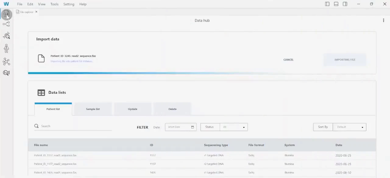
Step 1 of 6. File explorer imports sequence files and organises them by sample. 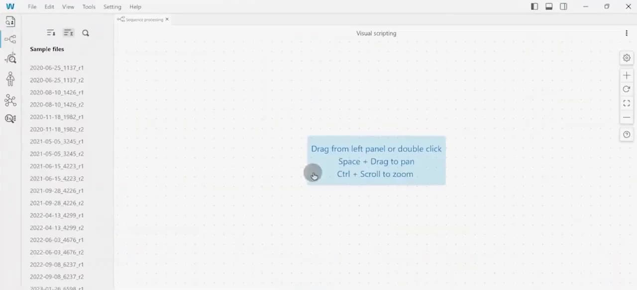
Step 2 of 6. Visual scripting aligns the sequence against the reference genome. 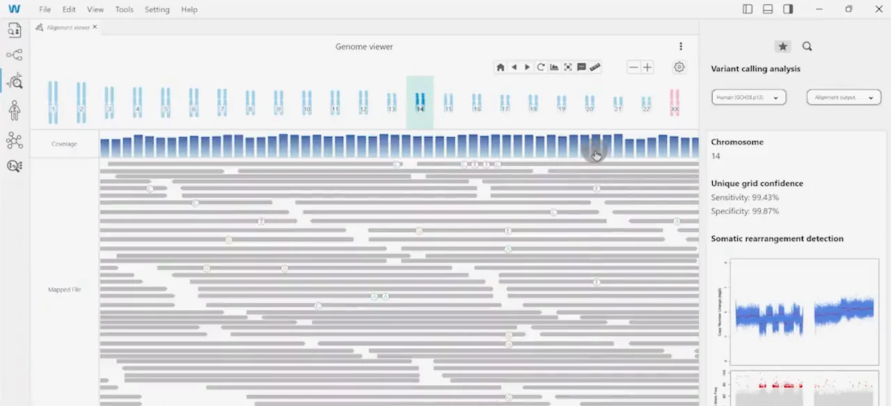
Step 3 of 6. Genome browser visualises reads and calls the variant, ending in a run action. 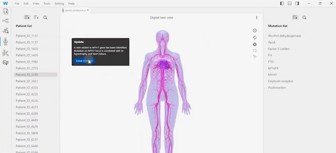
Step 4 of 6. Predisposition applies the variant to the patient digital twin. 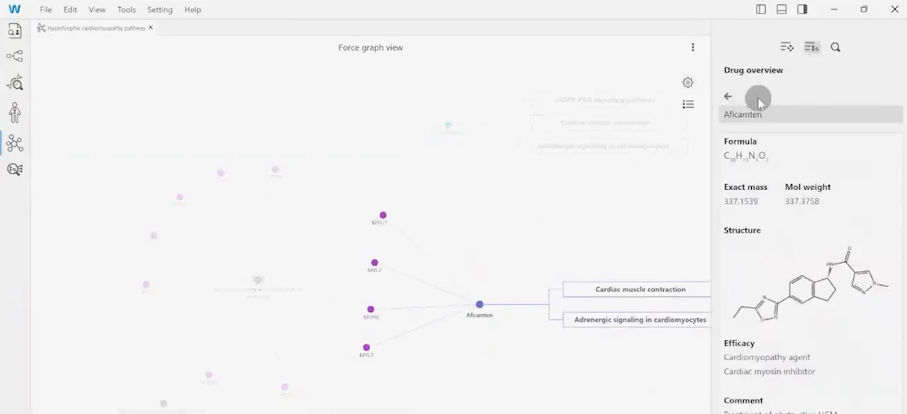
Step 5 of 6. Disease pathway maps what the variant interacts with. 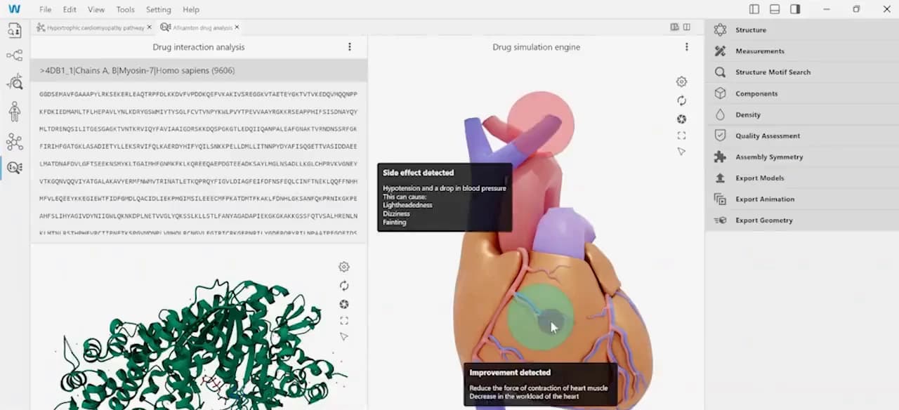
Step 6 of 6. Drug study simulates effect, surfacing benefit and side effect together.
Setting a Health Goal
The hardest screen in the app is the one where a person turns an insight into a commitment.
Breaking a complex form into four questions
Creating a goal requires an activity, a measurement, a schedule and a set of reminders — enough fields to make a single form discouraging. I structured it as four plain-language questions, What, How much, When and Any details, presented as an accordion that opens one section at a time. Each completed section collapses to a summary line, so the form shortens as it is answered rather than growing longer.
Offering guidance at the point of hesitation
Choosing a target is where people stall, because it requires knowing what a reasonable number looks like for their condition. I placed the recommendation inside the How much step rather than ahead of the form, so guidance arrives at the moment of doubt instead of front-loading advice a person has no context for yet. The sheet covers duration and intensity, heart-rate monitoring and recovery, then returns the person to the field they left.
Keeping the commitment in reach
The Save action stays pinned below the form throughout, so progress toward finishing is always visible. Categories are chosen before the form opens, so every field that follows is already scoped to what the person is trying to do.
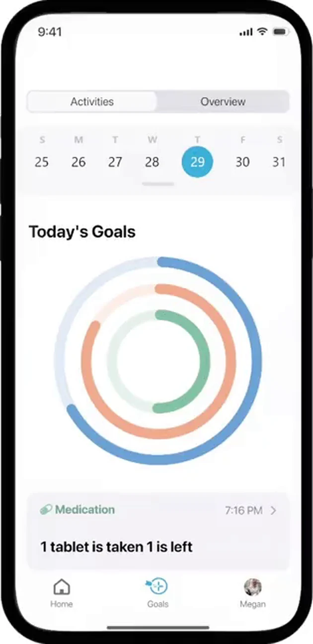
Step 1 of 9. Goals opens on current progress, before asking for anything new. 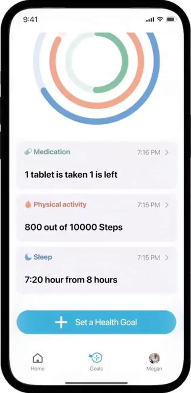
Step 2 of 9. Setting a goal is the primary action, placed after the current state. 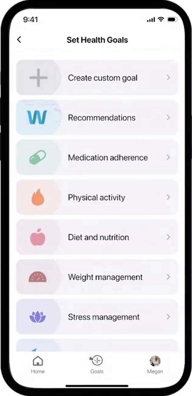
Step 3 of 9. Seven categories scope the form before it opens. 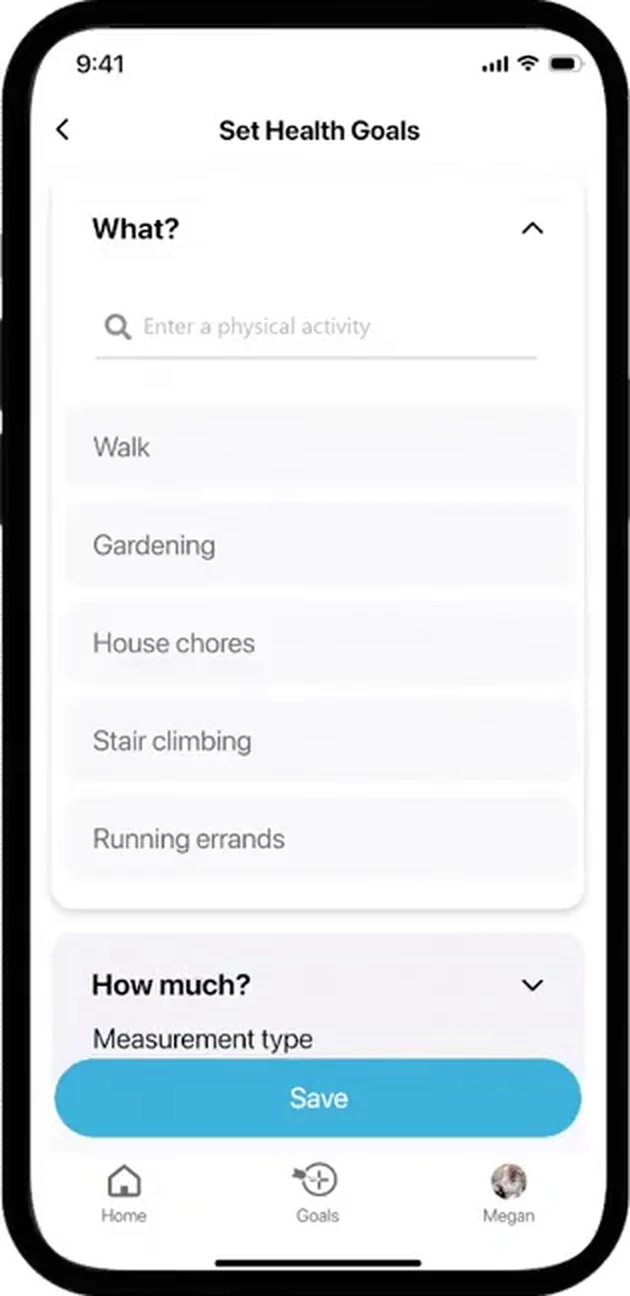
Step 4 of 9. The What step suggests activities instead of asking for free text. 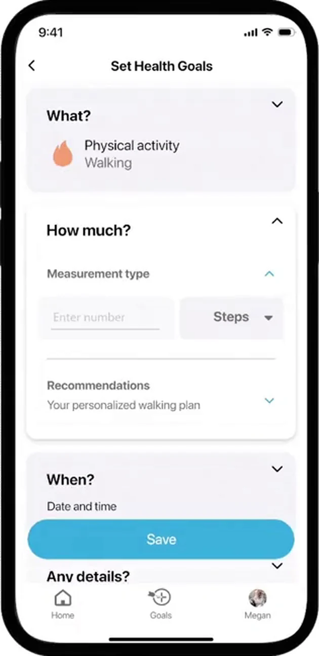
Step 5 of 9. Measurement type adapts to the activity chosen. 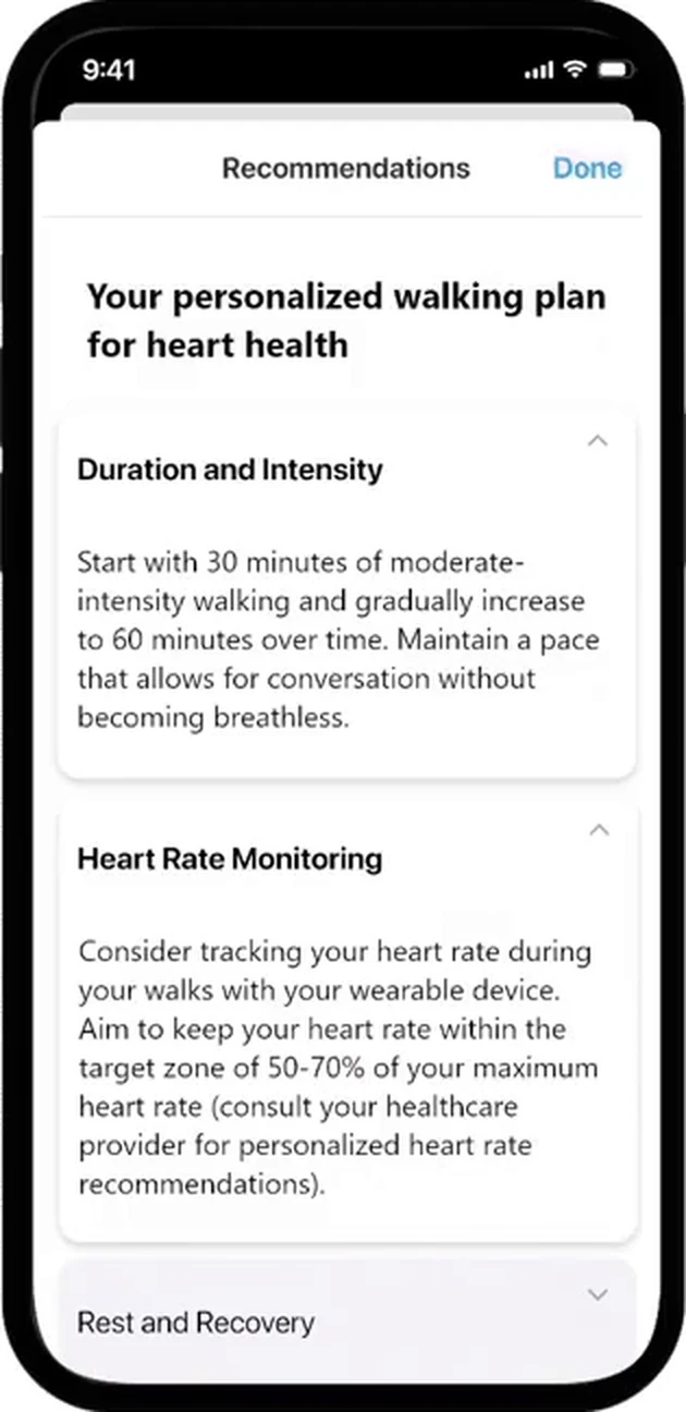
Step 6 of 9. Recommendations open inside the step where the target is set. 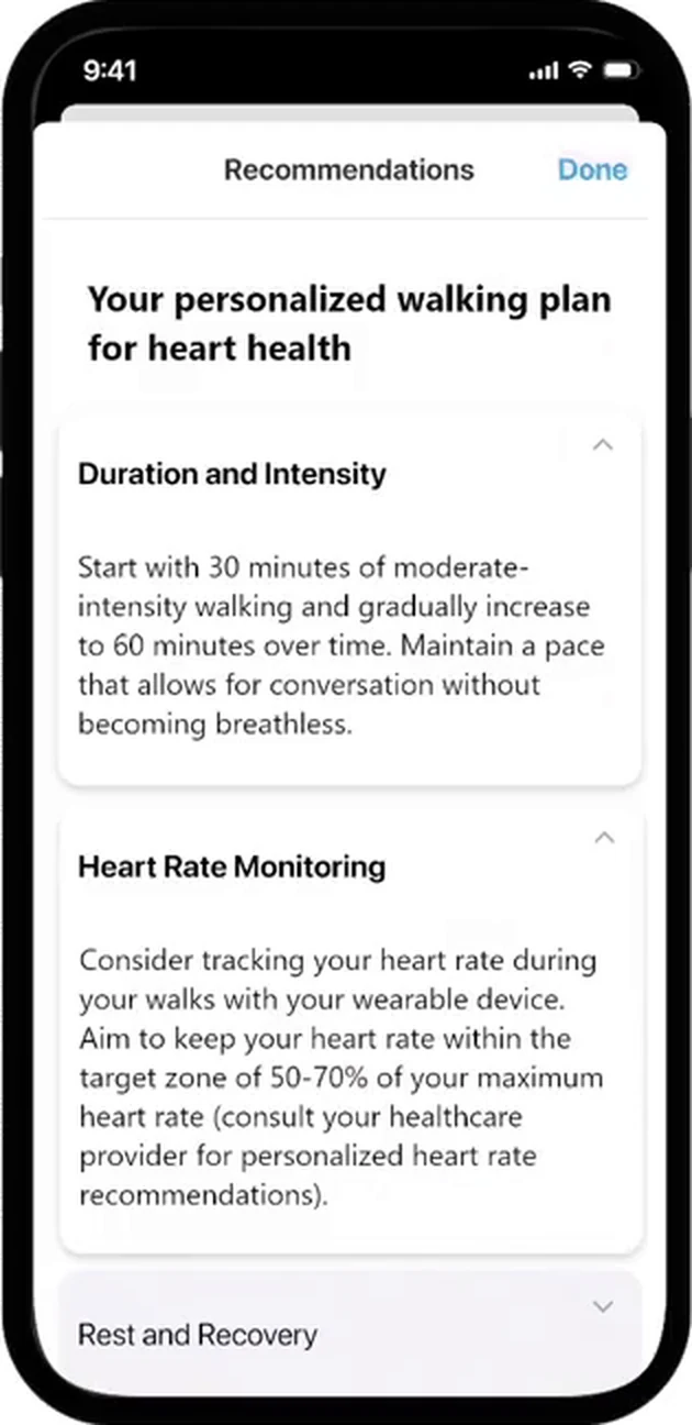
Step 7 of 9. Guidance covers intensity, monitoring and recovery, then returns to the field. 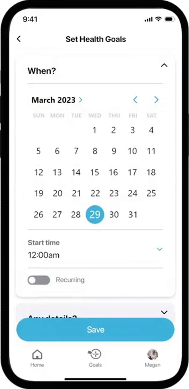
Step 8 of 9. Scheduling combines date range, start time and recurrence. 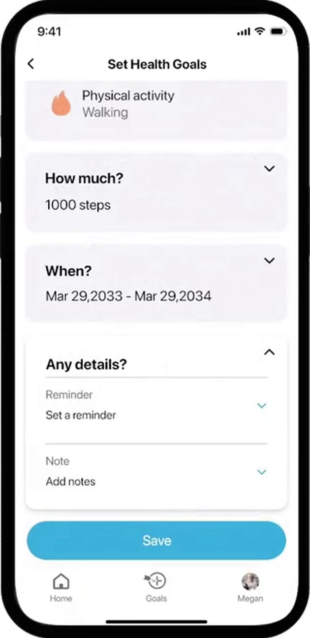
Step 9 of 9. Answered sections collapse to summary lines, leaving Save in reach.
What I learned
Speculative design needs clear boundaries
Precision medicine is full of promise and still far from arriving. Designing for it meant separating imagined experiences from validated technology, communicating future-facing ideas without presenting them as current clinical capability, and keeping the concept adaptable rather than merely aspirational.
Prototyping made complex ideas testable
Prototyping turned an abstract healthcare ecosystem into workflows people could respond to. I tested with students, healthcare professionals, and general users, with guidance from faculty and external mentors at SFU and BC Cancer, then revised both the concept and how information was presented.
Designing for two very different users
Designing for clinical teams and individuals at once required different levels of detail, language, and control. It also reinforced how much privacy, consent, and user control matter when sensitive health information is presented or shared between people.
Holdout